Most Professional Excel Project Portfolio Templates on the Market
Analysistabs Project Portfolio Templates are our most Popular templates, making it the most trusted and complete Excel Project Portfolio Management Template on the market. Powerful options, unique template layouts and modern designs are the reasons our customers have fallen in love. We are dedicated to providing you with the best experience possible. Read below to find out why the sky’s the limit when using Analysistabs Excel Project Management Templates.
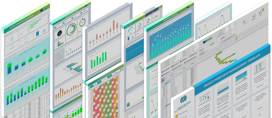
WORLD-CLASS TEMPLATES WITH POWERFUL FEATURES.
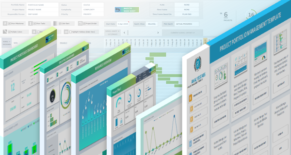
We built and enhanced this template based on our customers across the globe. We took years to reach this state of the template with Dynamic Dashboards, Powerful Gantt Chart, Easy to use data sheets and Template Options.
Excel Templates
6 Excel Project Portfolio Management Templates
Effectively Manage Your Project Portfolios using our Project Portfolio Management Excel Templates. We have Provide 2 Separate Portfolio Management Excel Templates, one for Managing Multiple Portfolios, and one for managing Single Portfolio. We have also Provided 2 Project Portfolio Dashboard Templates and 2 Project Prioritization Matrix for Prioritize Your Projects.
Project Portfolio Management Excel Templates.
We have created 2 Advanced Project Portfolio Management Excel Templates to Manage Your Portfolios more effectively. You can use Standard Version for managing all your Activities of a Single Portfolio in a One Excel File. Advanced version is created to manage all the activities of Multiple Projects Portfolios in One Excel File.
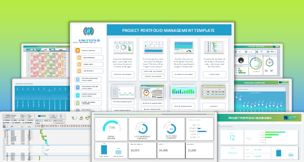
Project Portfolio Management Template – Advanced
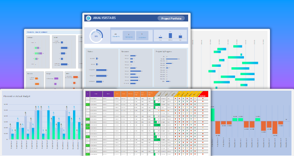
Project Portfolio Management Template – Standard
Project Portfolio Management Dashboard Templates.
Project Portfolio Management Dashboard Excel Templates helps you to quickly visualize the summaries of the project portfolio key metrics. We have provide two Excel templates to create dashboards with drill-down filters.

Project Portfolio Management Dashboard – Advanced

Project Portfolio Management Dashboard – Standard
Portfolio Prioritization Matrix Excel Templates.
Here are the Project Portfolio Prioritization Matrix Excel Templates for Managing the Priority of Your Projects. You can use this Excel template to enter Importance, Feasibility and Benefit of the projects in portfolio to view the Portfolio Prioritization Matrix. We have created two Excel templates (Standard and Advanced templates) to find project priority ranks.
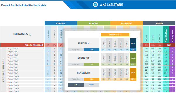
Project Portfolio Prioritization Matrix – Advanced
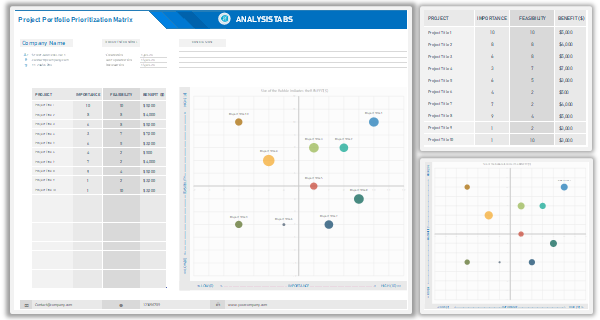
Project Portfolio Prioritization Matrix – Standard
DYNAMIC DASHBOARDS.
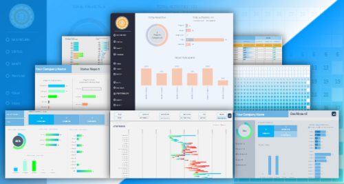
Dynamic dashboards helps you to understand your Projects and Activates using rich graphical visualizations. Charts and Information will change based on selected Project or Person. Powerful and Interactive Dashboards for you that you need unique, professional, clean, creative visualizations. All graphics designed using built-in Excel Charts, Shapes and Styles. We have created separate Worksheet for dashboard Calculations, you can unhide the sheets and change the formulas if required. You can add your own Charts and other visual graphics to the sheets if required.
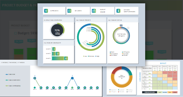
Executive Dashboard
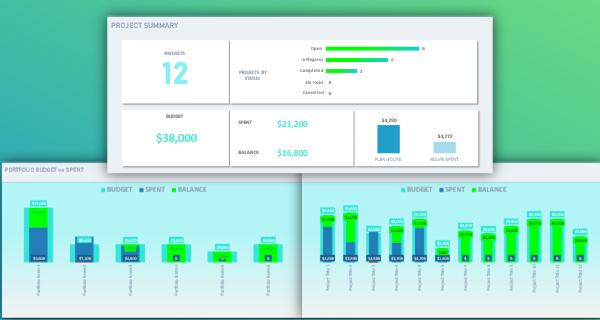
Project Portfolio Dashboard
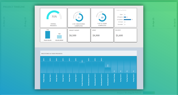
Project Dashboard
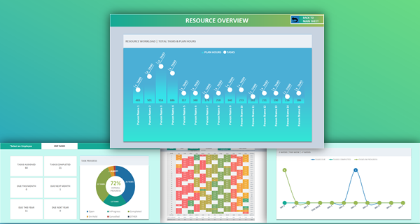
Resource Dashboard
ADVANCED GANTT CHART WITH DRILL-DOWN ANALYSIS.
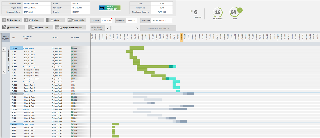
Powerful Gantt Chart with numerous tools to drill down into any level of the project. Now you can analyse your plans and see the visual representation of your timelines dynamically.
TEMPLATE SETTINGS.
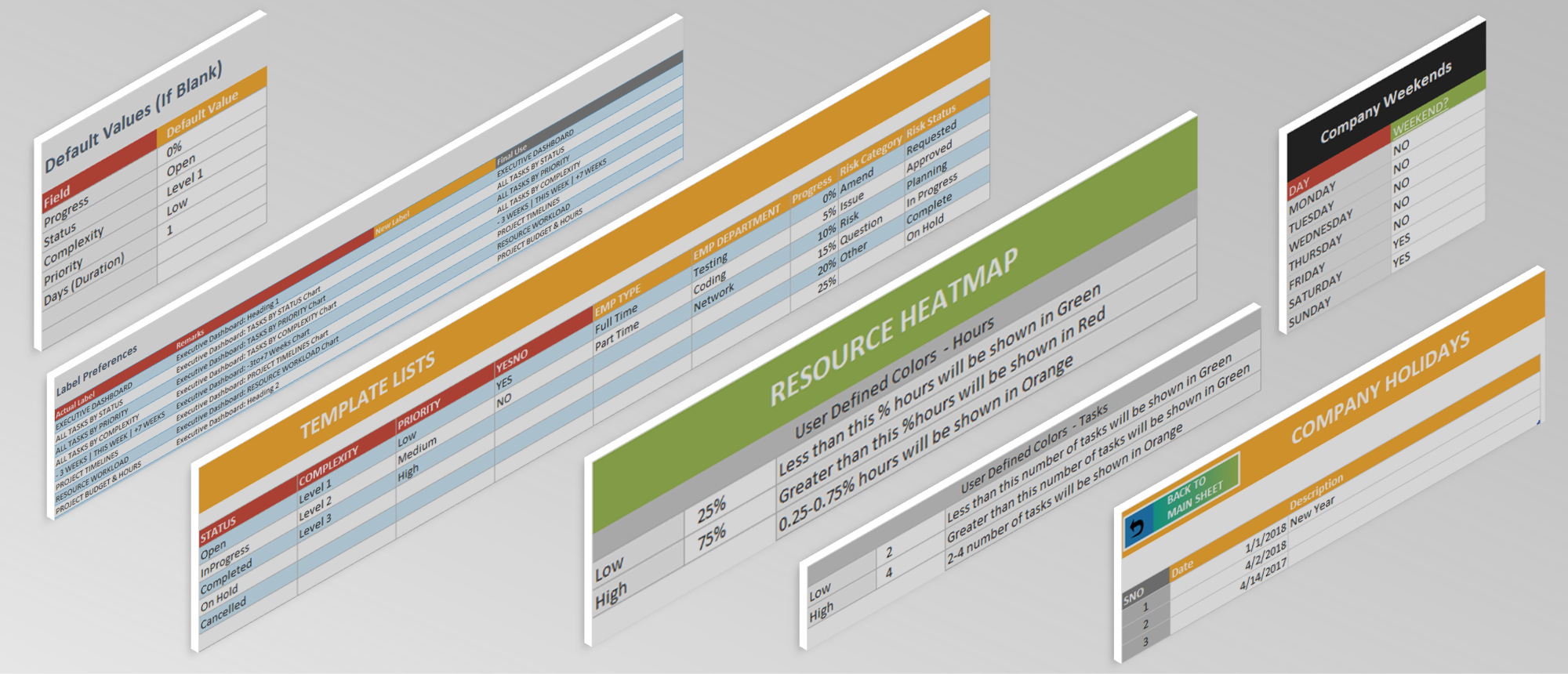
Analysistabs does not limit you to one setup, we prefer to give you options. Customize the template using our Template Preferences, Lists. We have provided the options to Set Your Company Week ends and Holidays.
+ PROJECT PORTFOLIO POWERPOINT TEMPLATES.
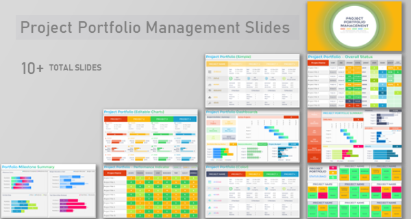
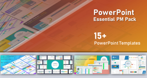
10+ Useful slides to present your project portfolios.
Project Portfolio Management Template
Get Instant Access in 3 Simple Steps
Trusted by 6,500+ users worldwide
Project Managers from the biggest brands in the world choose us for managing their Projects, Tasks and Resources.


Brian –
The executive portfolio dashboard finally aligns leadership conversations. Department filters, KPI cards, and variance bars surface problem programs instantly, so our Monday reviews focus on decisions instead of reconciling five competing spreadsheets.
PNRao –
Thrilled the dashboards are driving decisive meetings, Olivia! We designed those filters to spotlight outliers immediately. Next update adds saved views and quick links, so each leader jumps straight to their portfolio slice.
Marcus –
The prioritization matrix turned portfolio fights into data-driven discussions. Weighting feasibility versus benefit surfaced quiet, high-leverage initiatives. Funding shifted within days, and our roadmap finally feels strategically coherent.
PNRao –
Exactly the outcome we hoped for, Marcus. Upcoming sensitivity sliders will simulate different weightings live, so you can test executive scenarios without rebuilding scores between meetings.
Lucas –
The slide pack template saved our quarterly review. We exported portfolio snapshots and variance charts directly—consistent branding, zero screenshot gymnastics. The board actually discussed outcomes instead of formatting.
PNRao –
Great to hear, Lucas. We’re adding auto-generated speaker notes from risk, issue, and decision fields, giving presenters crisp talking points for each slide automatically.
Benjamin –
A workload balance that suggests safe resource swaps across programs would be game-changing—“move Dana three days to Portfolio B to prevent next week’s spike.”
PNRao –
Great idea, Benjamin. We’re prototyping recommendation insights using skills, availability, and deadlines; suggested moves will appear alongside capacity bars for one-click what-ifs.
Samantha –
Color-blind colleague reads the dashboard comfortably after switching to the blue-orange scheme. Keyboard navigation also helps reviewers who avoid the mouse during presentations.
PNRao –
Accessibility matters, Samantha. We’re shipping additional color-blind presets, higher-contrast modes, and alt-text for key visuals, broadening inclusive support for diverse teams.
Lily –
The side navigation and yellow edit zones guided new analysts immediately. Within a day, they were authoring portfolio updates without Slack pings for directions.
PNRao –
That’s wonderful, Lily. We’re adding contextual pop-overs the first time someone enters each sheet, with short tips linked to the relevant help article.
Henry –
Quarterly rollups auto-populate beautifully. The annual summary and trend columns revealed a chronic Q3 marketing overspend we had normalized. We fixed it before next budgeting cycle.
PNRao –
Great catch, Henry. We’re adding quarter-to-date tiles and budget carryover flags, so recurring seasonal patterns become obvious the moment they begin to deviate from plan.
Sophia –
Resource and project dashboards communicate capacity beautifully. Heat maps revealed persistent fronted bottlenecks; we re balanced in one session and delivery velocity improved within weeks. The clarity beats any slide deck we’ve used previously.
PNRao –
Wonderful impact, Sophia! Capacity visibility is half the battle. We’re prototyping workload variance alerts and per-skill capacity lanes to make imbalances unmistakable before sprint planning begins.