

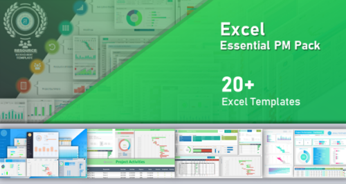
EXCEL PROJECT DASHBOARD
PROJECT DASHBOARD EXCEL TEMPLATE.
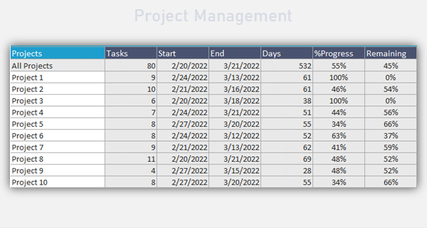
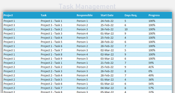
This Excel Simple Template helps you to create Dashboard of your Projects. We have included 4 Sheets to easily crate dashboard for your projects. You can Enter Project and related Task details and the Dashboard will update automatically.


TEMPLATE INCLUDES 4 SHEETS.
Get Instant Access in 3 Simple Steps
Trusted by 6,500+ users worldwide
Project Managers from the biggest brands in the world choose us for managing their Projects, Tasks and Resources.

Omar –
The four-sheet structure is perfect—Dashboard, Gantt, Projects Summary, and Data Sheet. We entered tasks once, and the visuals updated immediately. Monday stand-ups finally focus on decisions instead of reconciling three different spreadsheets.
PNRao –
That’s exactly the intent, Omar! Keep Projects Summary authoritative for owners and statuses, then let the Dashboard do the storytelling. Save your favorite slicer/filter setup as a view for lightning-fast recurring reviews.
John –
Replaced our messy trackers in one afternoon. The simple Gantt plus concise KPI cards keeps execs aligned, and exporting a clean PDF takes seconds. Zero macros to fight, just structured tables and formulas.
PNRao –
Thrilled it streamlined your week, John. For pristine exports, use the built-in print preset and a margin preview. We’re considering a one-click “Executive PDF” view to lock consistent framing every time.
Allison –
Dependencies with simple finish-to-start logic and automatic date propagation would eliminate tedious nudging when a key milestone slips. Even basic lag/lead would cover most real-world cases.
PNRao –
Excellent ask, Allison. We’re exploring lightweight dependencies with guardrails and optional lag/lead. Until then, add a “Blocked By” column and review that filtered list first during triage sessions.
Smith –
Best $49 we spent this quarter. We canceled a heavy add-in and kept everything native to Excel. Finance likes the transparency; PMs like the speed; leadership likes the consistent weekly story.
PNRao –
Music to our ears, Smith. Version your file monthly for an audit trail and attach the exported Gantt PNG to your cadence emails. It reinforces one dependable source of truth each cycle.
Chole –
Can we start weeks on Monday and hide weekends on the Gantt for software sprints, without breaking KPI tiles or the percent-complete math?
PNRao –
Yes—set working-day columns to Monday–Friday and hide weekend columns on the chart. The Dashboard KPIs reference totals, not column visibility, so your metrics remain correct.
Priya –
Branding took five minutes: palette swap, header font change, and a logo in the Dashboard. Contrast remained excellent, and overdue bars still popped on a bright projector.
PNRao –
Great customization, Priya. Save that as your master template so new teams inherit the palette automatically. Maintain strong contrast on deadline and overdue states for meeting-room visibility.
Henry –
Handled ~900 tasks across nine projects smoothly. Filtering by owner, status, and date bounds felt instant during a live Zoom demo. Nothing jittered, even screen-sharing the Gantt.
PNRao –
Awesome benchmark, Henry. For even snappier edits, switch to manual calculation while bulk-updating tasks, then recalc before export. Scoping conditional formats to used ranges also keeps things crisp.
Benjamin –
A lightweight capacity lane showing per-owner task counts by week would help justify staffing changes. Right now we eyeball the Gantt and debate who’s truly overloaded.
PNRao –
Great idea, Benjamin. A capacity strip is on our roadmap. Meanwhile, insert a pivot by Owner × Week from Data Sheet and pin it to the Dashboard for an instant overload snapshot.
Marcus –
The executive snapshot shows schedule health at a glance. Switching between baseline and actual dates exposed creeping slippage early enough to reassign work. We avoided a customer launch miss because the signals were obvious.
PNRao –
Fantastic save, Marcus. Consider thin baseline bars beneath actuals for high-contrast variance. We’ll share a short guide on variance badges so risks pop instantly during leadership walk-throughs.
Oscar –
Blue-orange palette plus larger labels improved readability for color-blind teammates on the projector. Keyboard navigation through slicers also helps presenters who avoid the mouse.
PNRao –
Accessibility matters, Oscar. We’ll add a few more high-contrast presets and a short slide on keyboard shortcuts for live demos, so presenters can tab through views confidently.
Paula –
The cover sheet notes and tiny in-cell hints were enough to get going without training. We appreciated the sensible defaults and the clear “editable vs. calculated” cues.
PNRao –
Thanks, Paula! We’ll keep expanding those micro-hints and add a collapsible legend explaining each KPI tile, so new users understand the math behind the dashboard at a glance.